01 — Brand Story
Two forces. One precision system.
SNUS SWEDEN is engineered for the modern adult consumer — authentic Swedish origin, dark-tech clarity, and a visual language built on interlocking structure.
 SNUS SWEDEN Brand Book
Brand Identity Guidelines & Portfolio
Dual Hex · Sweden · Premium Snus
SNUS SWEDEN is engineered for the modern adult consumer — authentic Swedish origin, dark-tech clarity, and a visual language built on interlocking structure.
Where Layout 4’s vortex DNA brought kinetic premium energy, SNUS SWEDEN crystallizes Swedish origin into structure: two interlocking cells, twin “S” glyphs, and a gradient bridge of cyan and amber orange.
Navy anchors trust. Cyan signals precision. Amber orange marks Sweden and conversion. Black stages the brand like a luxury product — never loud, always deliberate.
SNUS SWEDEN speaks to adult consumers who want performance without theatrics: authentic Swedish snus and adult formats designed for discreet, regulated, premium use.
Deliver precision-formulated adult products with uncompromising design standards, clear compliance, and a brand experience that feels engineered — not improvised.
Become the definitive Swedish premium identity in adult snus — recognized for interlocking craft, dark-mode elegance, and responsible modern retail.
Clarity in every touchpoint: from hexagon mark to checkout, from pouch sleeve to staff apparel — one coherent Dual Hex system.
The Dual Hex mark is the brand’s structural signature. Preserve proportions, color roles, and clear space at every scale.
Vertical lockup is primary. Horizontal and icon-only variants support constrained spaces while retaining dual-hex recognition.
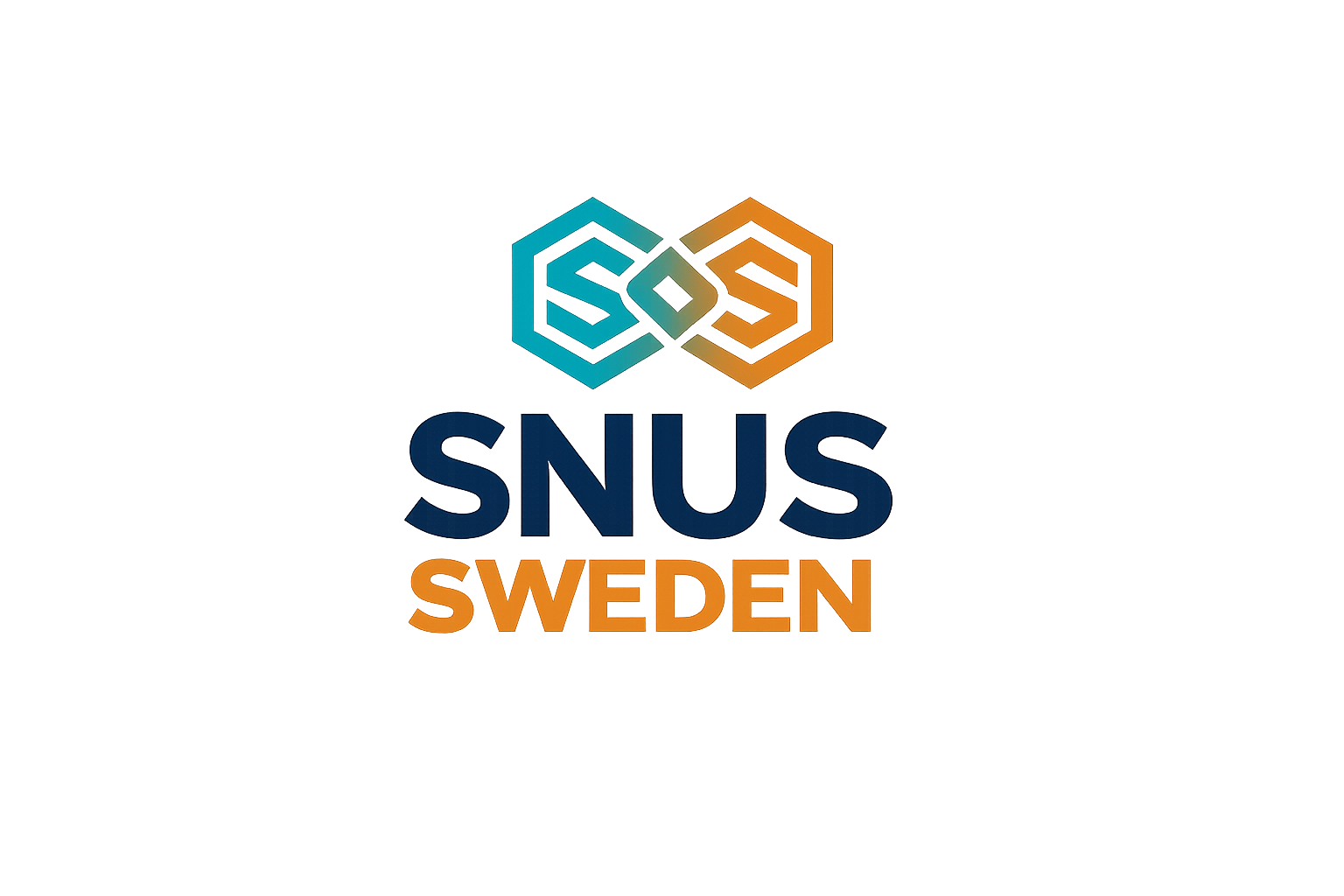
Build on a modular hex grid. Clear space equals the height of one internal “S” stem on all sides.
Two regular hexagons interlock on a shared vertical axis. Center diamond is the brand “bridge.”
SNUS in navy; SWEDEN in amber orange, same block width. Geometric sans, heavy weight, tracked caps.
Mark width ≈ SNUS / SWEDEN block width. Vertical gap = 0.35× mark height.
Print ≥ 28mm
Digital ≥ 96px
Icon ≥ 32px
Never shrink below minima. Prefer icon-only when vertical lockup becomes illegible.
Cyan and amber interlock. Navy stabilizes. Black stages. Silver articulates.
Extracted from BTB-logo.png and calibrated against Layout 4’s premium-tech template for digital and print.
Left hex · links · secondary CTA · borders
Right hex · primary CTA · accent bars · warmth
SNUS wordmark · headlines · authority surfaces
Logo canvas · header · hero · packaging
Pressed states · dark accents
CTA hover · print amber
Headlines on dark · chrome detail
Page canvas · light UI
Dividers · input fills
Body secondary · captions
| Element | Primary | Secondary | Notes |
|---|---|---|---|
| Header / Footer | Black #0A0A0A | Cyan border | Vertical or horizontal lockup |
| Hero | Navy → Black gradient | Amber CTA | Hex pattern overlay at low opacity |
| Primary button | Amber #E48418 | White type | Shop / Add to cart |
| Secondary button | Cyan outline | Silver type | Explore / Learn more |
| Product tags | Cyan tint | Navy text | Keep quiet — not pill clusters |
| Compliance | Charcoal #1A1A1A | White | 18+ nicotine warnings |
| Pairing | Contrast | Body Text | Large Text / UI |
|---|---|---|---|
| Navy on Fog | ~11.2:1 | AAA Pass | Pass |
| White on Navy | ~11.8:1 | AAA Pass | Pass |
| White on Cyan | ~3.2:1 | Fail | AA Large |
| White on Amber | ~3.6:1 | Fail | AA Large / Buttons |
| Cyan on Black | ~6.1:1 | AA Pass | Pass |
Use cyan and amber for accents and large UI chrome — not long-form body text on tinted fields.
Montserrat carries the Dual Hex geometry — consistent stroke, modern authority, tech clarity.
Body copy stays calm and legible at 15–16px with 1.65–1.7 line height. Compliance messages use slightly tighter leading and unambiguous language. CTAs are uppercase, tracked, and weight 700.
Caption · 12px · Tracking 0.16em
Montserrat — display, UI, wordmark companion.
Montserrat Regular/Medium — long-form body and forms.
Montserrat ExtraBold for heroes; IBM Plex Mono for values.
Patterns, icons, and gradients extend the interlocking mark without competing with it.
Hex Lattice
Primary background graphic for heroes and packaging tissue.
Dense Dual Tone
Cyan + amber stroke honeycomb for dark apparel and tape.
Interlock Gradient
Cyan→Amber bridge from the mark’s center diamond.
Energy Radial
Soft dual glow for product stages and loading screens.
Precision Lines
−30° technical hatching for stationery undersheets.
Mark as Seal
Centered emblem on black — highest brand gravity.
Uniform 2px strokes, geometric terminals, clipped in hex containers.
Photography should feel like a precision product launch — never lifestyle clutter.
Low-key lighting, cyan rim light, amber practicals, deep navy falloff. Product is the hero — environments stay abstract and architectural.
Centered cans/pouches on black or fog. Soft top light + cyan edge. Minimal props. Hex reflection optional at ≤10% opacity.
Adult hands, night urban glass, gym-adjacent calm — never party excess. Crop tight. Grade cool with warm amber accents.
Full-bleed or hard geometric crops. Avoid floating cards in hero. Prefer edge-to-edge stage planes.
A premium e-commerce system using Dual Hex color, typography, and compliance discipline.
Cool precision pouch with Dual Hex packaging. Discreet delivery, regulated strength, engineered for adult focus.
Engineered for pure Swedish snus — precision-formulated adult products with Dual Hex aesthetics and full regulatory compliance. We design for discretion, clarity, and modern retail performance.
Tablet layout
CARTAdults 18+
ShopMobile < 860px · Tablet < 1100px · Desktop 1280+
Hero remains one composition. Nav collapses. Product grids stack. Amber CTA stays thumb-reachable.
Black, navy, cyan accents — consistent Dual Hex language across desk and identity systems.
FIELD NOTES
Brand Director
Operations · Level 2
Navy and black garments; cyan/amber mark placement — chest, back, and cap front.
Navy body · left-chest icon
Centered vertical lockup
Large mark · tonal print
Charcoal · front seal
Black shell · chest icon
Navy · front hex mark
Retail & event staff
Warehouse · high-vis + mark
Standard retail polo system
Black prestige for product; kraft utility for logistics; cyan/amber seals everywhere.
BATCH · SS-18+Print, OOH, and social templates that keep the mark heroic and copy sparse.
PREMIUM ENERGY · 18+
Shop NowDual Hex system
Precision formulas
Adults only · compliant
SNUSSWEDEN.COM
SNUS SWEDEN · ADULTS 18+
DUAL HEX · PREMIUM ENERGY
ENGINEERED FOR ADULT RETAIL
Brand Director · SNUS SWEDEN
alex@snussweden.com · +46 8 000 00 00
PREMIUM · DISCREET · 18+
Buttons, forms, feedback, and dashboard chrome aligned to Dual Hex tokens.
Interaction container for shop grids — border only when needed.
AddTracking email on the way.
Confirm you are 18+.
Please retry your card.
Discover Dual Hex Swedish snus.
Browse ShopThis path is outside the system.
Back HomeLanguage mirrors the mark: structured, confident, never playful or reckless.
Equip adult consumers with authentic Swedish snus products and a brand experience that feels as engineered as the formula.
Lead premium Swedish snus with a Dual Hex identity recognized for clarity, compliance, and modern retail craft.
Precision · Responsibility · Discretion · Craft · Consistency across every physical and digital surface.
Speak in short, decisive lines. Prefer verbs of engineering over hype. Acknowledge regulation plainly. Never glamorize excess.
Uppercase for CTAs and captions. Sentence case for body. Avoid slang. Use “adults 18+” language consistently in commerce and OOH.
“Precision Swedish snus for adults who value origin and discreet performance.”
“Crazy strong buzz for the party crew!!!”
Lead with origin + craft. Place compliance adjacent to product claims. Keep SNUS and SWEDEN paired in consumer lockups. Tagline options: “Dual Hex · Pure Swedish” / “Snus from Sweden.”
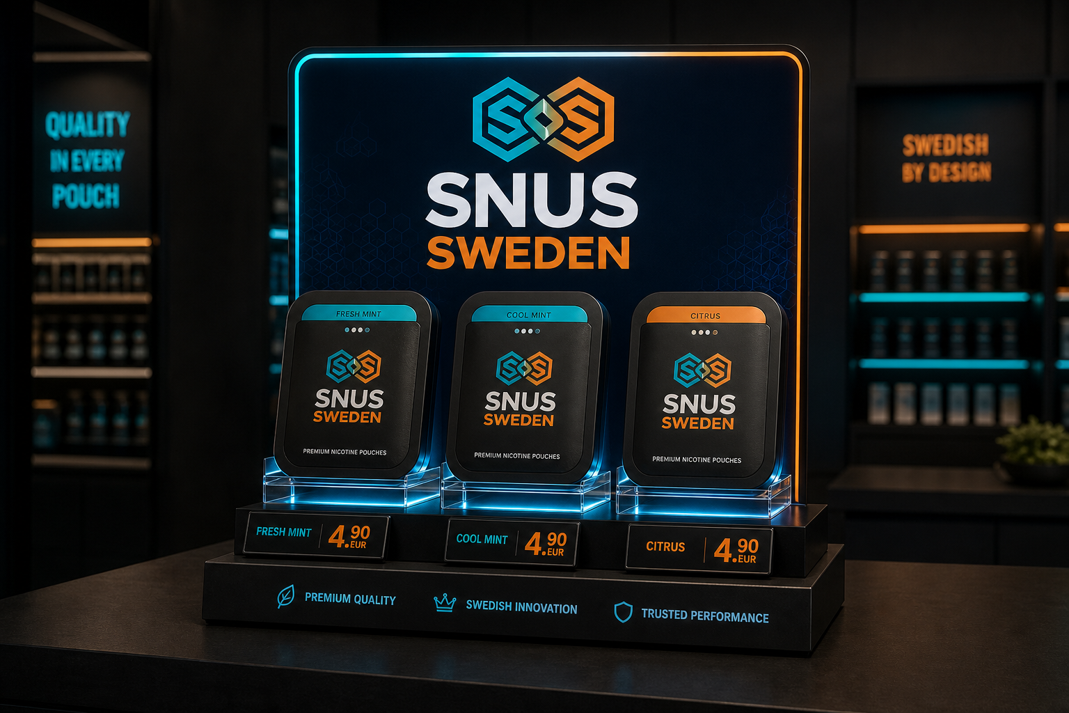
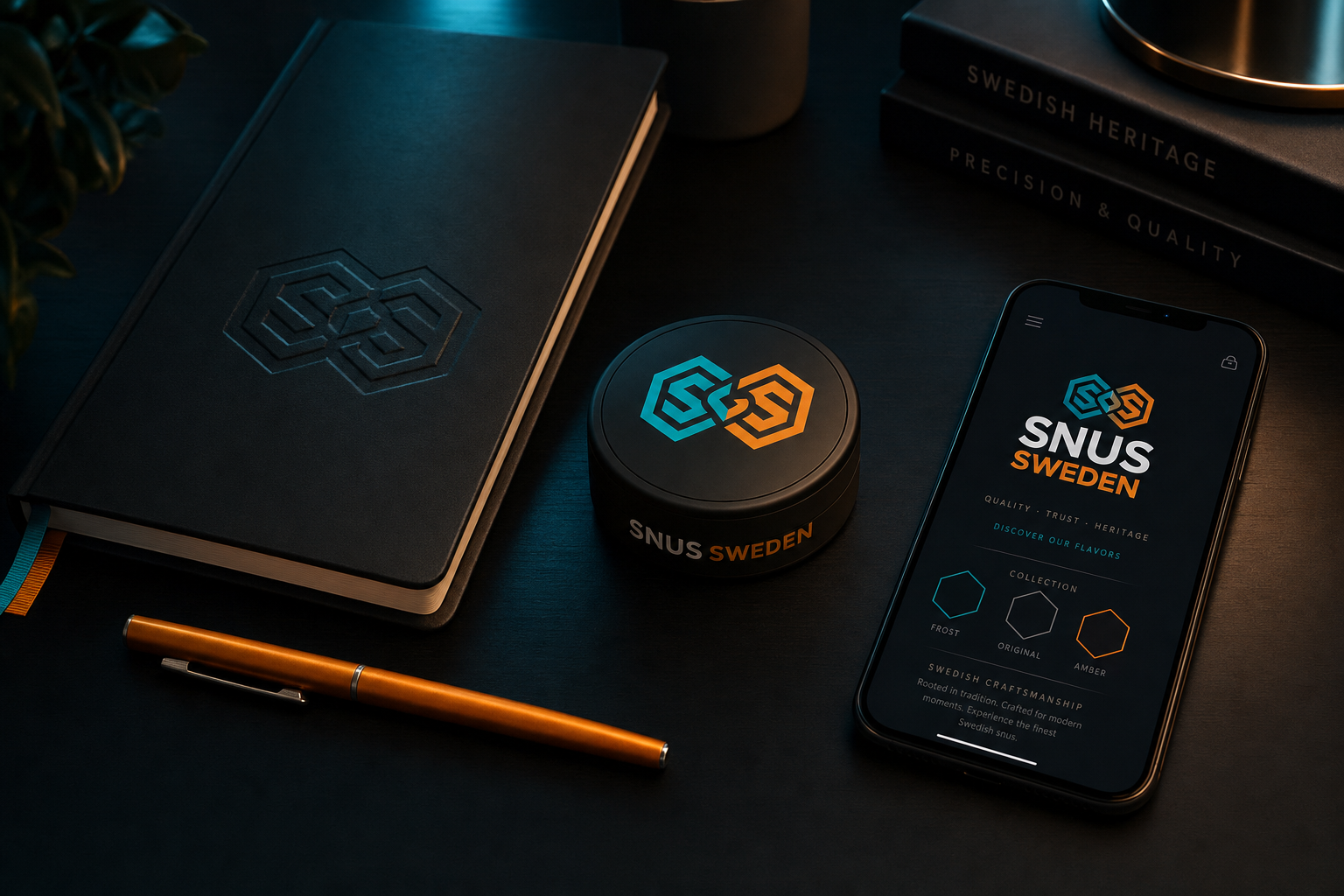
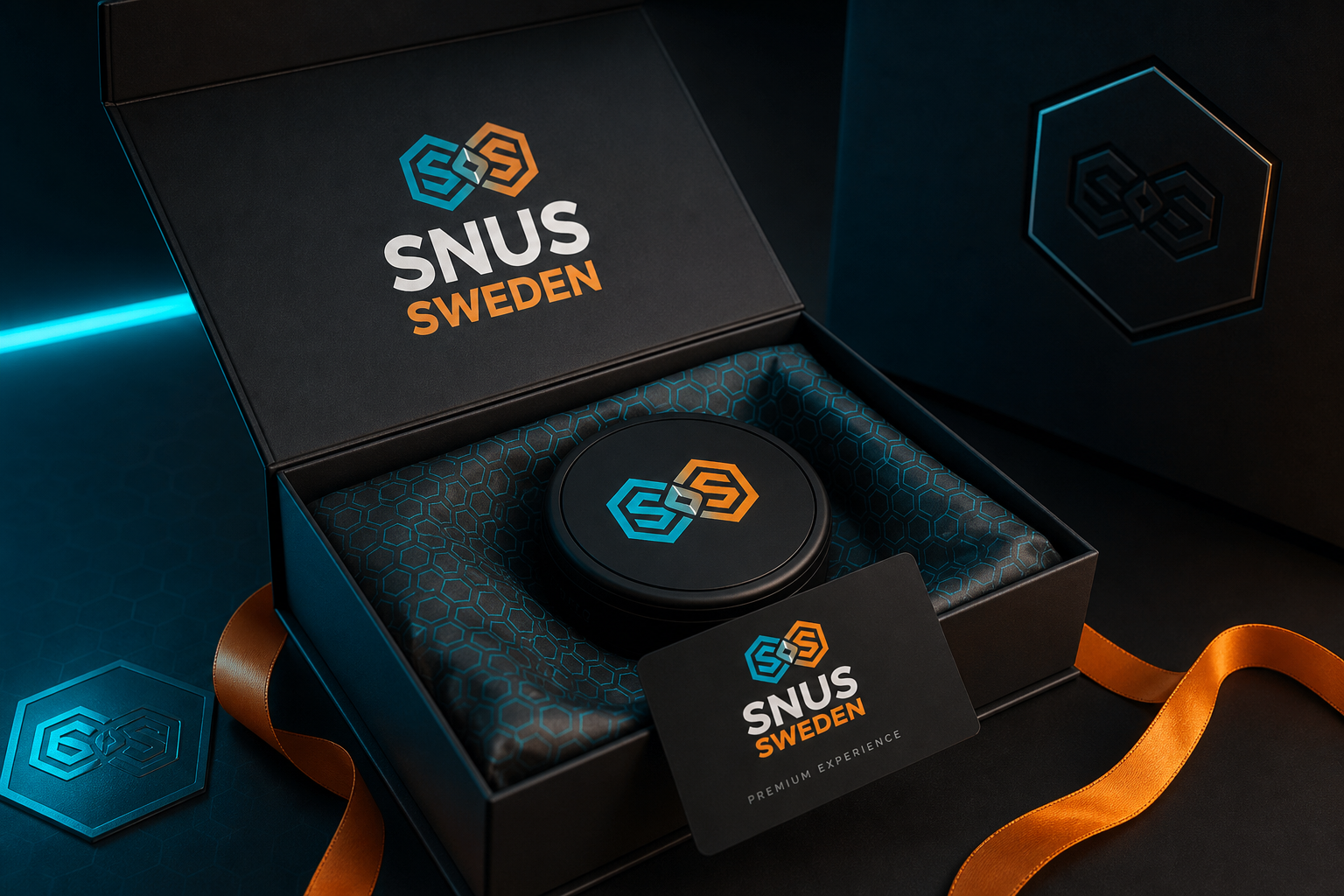
A quick mosaic of how Dual Hex holds under scale, substrate, and contrast shifts.
High-fidelity visuals built on Dual Hex color, type, and product staging — click any image to expand.
Four B2C surfaces: hero, categories, shop grid, and compliance footer — dark identity intact.
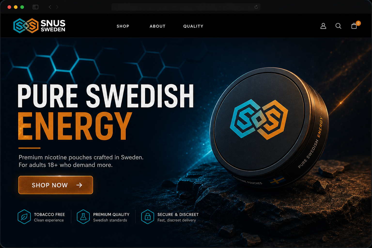
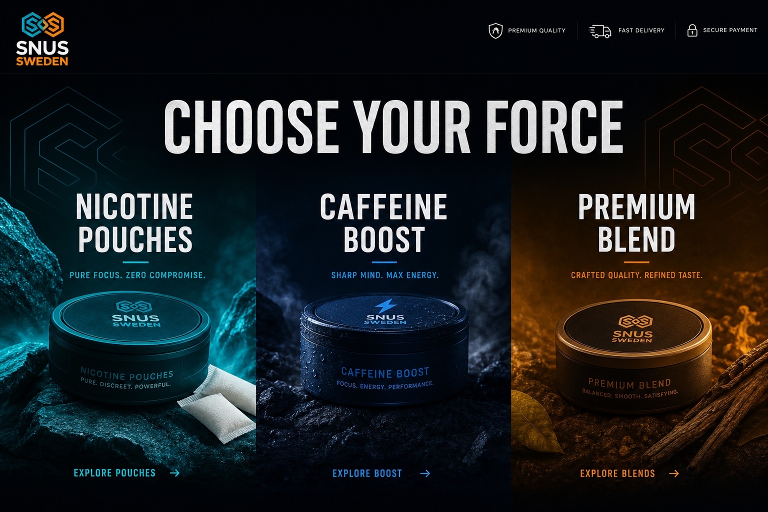
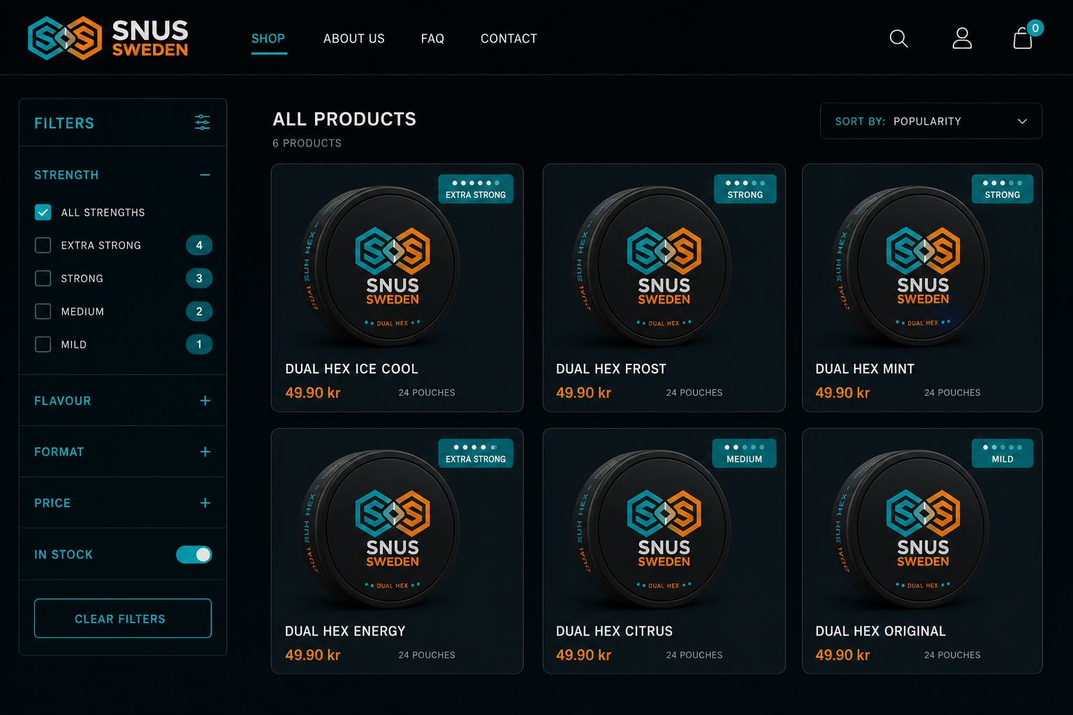
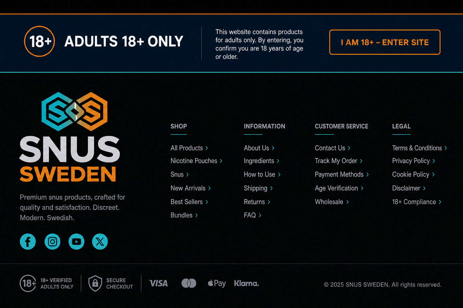
Four product environments showing how Dual Hex lives with real packaging and retail presence.
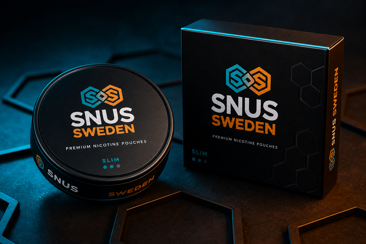
Use this checklist before releasing any branded asset.
A full Dual Hex ecosystem — logo, color, type, digital, print, apparel, packaging, and voice — ready for client delivery.